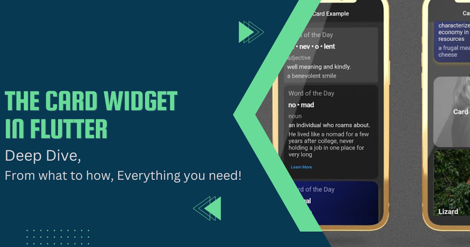
Build better Screens: Cards in Flutter
A Widget you'll use quite often to organise your screen


Hello hello hello everybody, Welcome back to another blog on Building with Flutter! Are you tired of boring, flat screens on your mobile app? Want to add some visual appeal and organization to your app's content? Then you are at the right place as we are gonna explore cards in Flutter.
Wondering what are Cards? How you can use them? How you can customise them? Where can you use them? Don't worry, through this article, you will find all the answers to your questions.
This blog is part of a Flutter series called "Build with Flutter" where I will teach you from the ground up about Flutter and building user applications with it. Wanna hop on the ride? Make sure to follow Rohit T or Subscribe to my newsletter here.
Now, without further ado, Let's dive deep into a specific widget that Flutter provides us with that makes it easy to organise data on the screen.
Introduction
What is a Card?
As you already know, every element or piece of UI is actually just a widget in a flutter. Card is no different.
The card is yet another built-in widget that is provided by Flutter which can be used to create visually appealing sections on your screen or parts of UI that look like actual cards.
Cards in Flutter provide a Material design with various properties to play with and customise your widgets such as elevation, border radius, child widget and many more.
Getting an idea about cards, But where do you actually use them?
Cards in Flutter are versatile and can be used in various ways, including but not limited to group related information, displaying user data, showcasing product details, or creating navigation menus.
They provide a clear visual hierarchy and help to organize content, making it easier for users to navigate and interact with your app.
While this is a higher level understanding, Let us dive deep and get our hands dirty by learning about different properties that you can use to play around with and customise your flutter cards.
Let's get right to it!
Different properties Card comes with
As we have seen earlier, Every element in Flutter is a widget and every widget have some set of properties that are used to customise the look and feel of your UI.
These properties are like configurations for your widgets. They tell Flutter how you want the certain widget to look like when it is built and rendered on screen.
So, When working with any widgets, understanding properties and playing with them gives you the best results.
Now, Let us see some of the properties that come with Cards in Flutter:
(We will also be seeing them in action under the 'Charts App' Section)
borderForeground
The borderOnForeground property is a Boolean value that determines whether the card's border should be drawn before or after its child. By default, it is true. If it is false, it paints the border behind the child. If set to true, the border will be drawn on top of the child widget.
This property can be useful when you want to create a card with a custom background image or colour, and you want the border to be visible above the background.
color
By default, a flutter card has a white background, but you can change it to any color and customise the look of the card by specifying a Color value using the color property.
You can use a variety of color values, such as predefined colours like Colors.blue, or you can create custom colours using the Color constructor.
The color property gives you the freedom to decide and design the look of the flutter card widget.
elevation
elevation, this is one property in Flutter cards that I use the most.
The 'elevation' property is a key feature of the flutter card widget that gives the widget a shadow depth, meaning lifting it above the plain screen and making it stand out.
The higher the elevation value, the more elevated the card appears, creating a sense of depth and hierarchy.
This property is important for creating a visually appealing and user-friendly interface, as it helps to distinguish cards or certain data from other elements on the screen and highlights the data.
The default elevation value is 1.0, but it can be customized using the elevation property. You can give any positive integer value to the property. By adjusting the elevation value, you can create different visual effects and add depth to your app's design.
How cool right? We will show you how to try it out in a couple of moments
margin
To define in simple language, This property takes in EdgeInsetsGeometry as the object to add empty space around the Card.
To give you a better understanding, The margin property in Flutter cards is a way to add space between the edges of the card and the surrounding widgets or screen.
By default, a card has a margin of 4.0 logical pixels on all sides, but you can adjust this value to increase or decrease the space as needed.
To set the margin for cards in Flutter, you can use the EdgeInsets class, which provides a convenient way to specify the amount of space on each side of the card.
shape
Simply defined, It is used to specify the shape of the card.
To give you a deeper understanding, The shape property in the Flutter Cards widget allows you to customize the shape of the card's border.
By default, a card has a rounded rectangular shape, but you can use the shape property to create a different shape, such as a circular or oval shape.
The shape property takes a ShapeBorder object, which is an abstract class that defines the shape of the border.
Flutter provides several built-in ShapeBorder subclasses that you can use, such as RoundedRectangleBorder, CircleBorder, and StadiumBorder. You can also create your own custom ShapeBorder by extending the ShapeBorder class and implementing its methods.
Yes, You have so many options to play with and customise your cards in flutter.
shadowColor
In simple words, It is used to paint the shadow of a card.
The shadowColor property of the Flutter Cards widget allows you to customize the color of the card's shadow.
By default, the shadow color is a darkened version of the card's background color. However, you can change this to any color you like using the shadowColor property.
For example, if you want to create a card with a green shadow, you can set the shadowColor property to a Color object that represents the desired shade of green. This can help to add contrast and depth to your card and make it stand out from other elements on the screen.
It's important to note that the shadowColor property only affects the color of the card's shadow and not the color of the card itself. To change the color of the card, you can use the color property instead.
clipBehaviour
This property decides whether the content inside the Card will be clipped or not.
What is Clipping behaviour to begin with?
Clipping behaviour refers to how the content of a widget is clipped or cropped based on its bounding box or a specific shape.
The clipBehavior property in Flutter cards is used to specify the clipping behaviour of the card's content.
By default, the card clips its content to the shape of its bounding box. However, you can change this behaviour by setting the clipBehavior property to a different value. It takes the Clip enum as an object. (By default, it is set to Clip.none)
While these are some of the properties that come with flutter cards' widgets, these are not all. There are more and you can always try them out yourself and customise your look. Use the documentation of Flutter as your guide or IDE suggestions help too.
Now that you have a good grip on what cards are in Flutter, and its properties, you are equipped to build one of your own now. So How do you do it? Let's get to it!
Charts App
Let us build a flutter card widget in an expense tracker app.
In this app, we need to display Bar graphs of a user's expenses. To make this chart stand out and separated as a separate section, We are gonna use the card widget in Flutter.
Let us see all the properties we have talked about in action:
import 'package:flutter/material.dart';

class ExampleCard extends StatelessWidget {
  const ExampleCard({super.key});

  @override
  Widget build(BuildContext context) {
    return Card(
      borderOnForeground: true,
      color: Colors.red,
      elevation: 20,
      shadowColor: Colors.blue,
      clipBehavior: Clip.antiAlias,
      margin: const EdgeInsets.all(40),
      shape: RoundedRectangleBorder(borderRadius: BorderRadius.circular(20)),
      child: const Center(
          child: Text('This is a sample of Card and It\'s customisation')),
    );
  }
}
The code is pretty self-explanatory as you glance through it and refer to the above-mentioned points.
The result would be something like this:
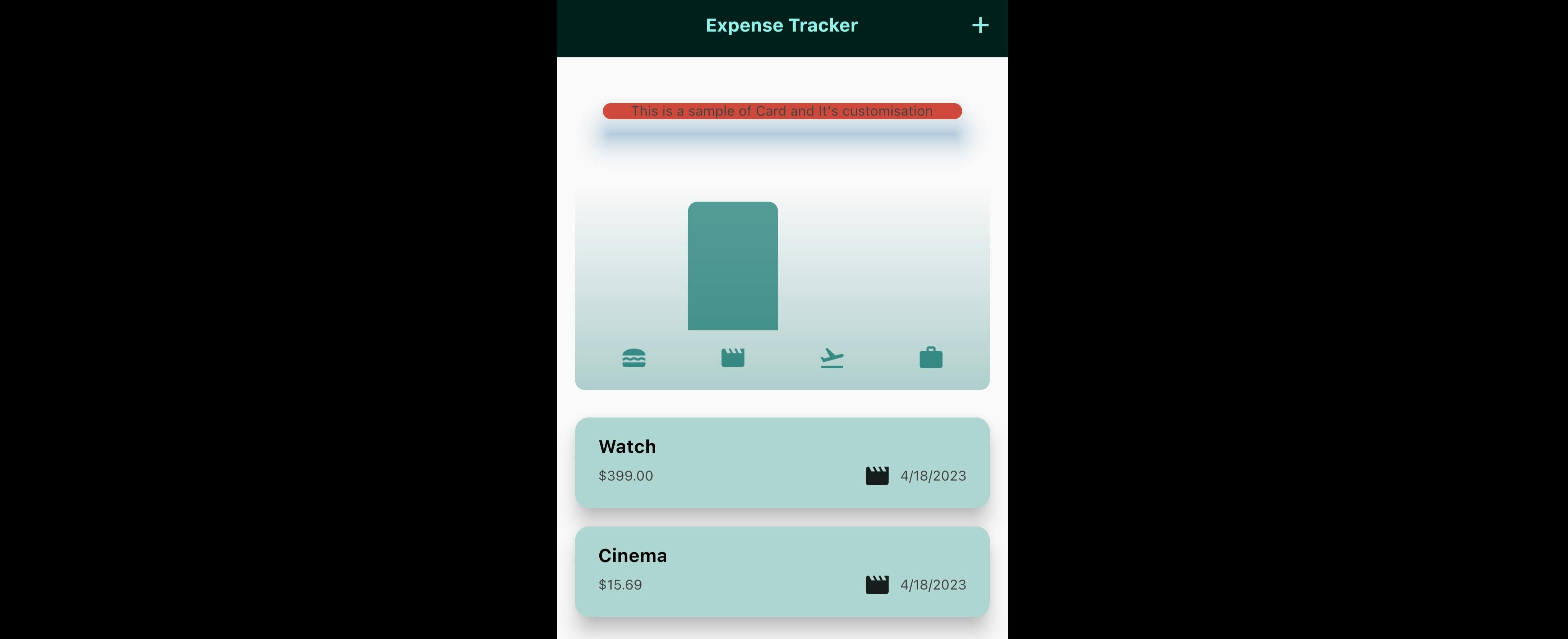
As you can see here, the Red Card that's standing out is a flutter card we just built.
In fact, the chart you see in the image is also built using the card widget.
Conclusion
If you have made it this far, Congratulations! You've learned how to create beautiful and functional cards in Flutter.
Here is a list of all the things we talked about in this article:
Giving you a solid understanding of the Card widget
A good understanding of its properties
How to use them to create different types of cards for your App
Implementation of flutter card with code example.
Remember to experiment with different properties, such as elevation, shape, and clipBehavior, to create unique card designs that fit your app's style and functionality.
And as always, keep practising and exploring different features of Flutter to improve your skills and take your mobile app development to the next level.
Closing remarks
Being a software engineer or developer is more than just code. Stay tuned for more!
Like | Comment | Share | Follow Rohit T for more!
Subscribe to my newsletter here, if you haven't yet. So you don't miss out on amazing content coming your way!
You can catch me on my socials here and drop a DM if you wanna work with me or for any opportunities. Thank you for reading! Happy Fluttering!
Do let me know how this article helped you, and what would you like me to cover next! Feel free to let me know if you think I should've covered something.